Agile Accessibility for MVPs - A11y Camp Talk
So you want to do accessibility in an agile way? But not a lot of time or expertise? Well this is the right place to start! This was my talk at the 2018 A11y camp in Melbourne, and I will endeavour to get you motivated to start on your own accessibility problems. This is a shortened version of that content so it’s even easier for you!
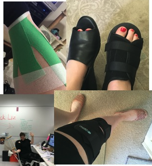
So why am I so interested? I am often injured, and a lot of it is yet to be explained as to why. I’ve had injuries in my hands and feet (and on one occasion, my head) and I became interested in accessibility when I was off work for an extensive period with a knee dislocation. I have no formal training in accessibility but I try to do my best, as should we all!
This talk …
- Primarily aimed at designers and developers
- Or those who work with them
- Focuses on the desktop experience
- Born from personal experience, frustration and struggling against time and budget
My role at Data61 is to get stuff done with limited budget and highly experimental technology. Easy right? No! So let’s break down the process starting with:
- What is an MVP
- Why do accessibility for MVPs?
- How to do accessibility for MVPs?
- New Challenges
1. What is an MVP
- “Minimal Viable Product”
- Coined in the Lean Startup by Eric Ries
- Involves testing a risk assumption often paired with fast analytic driven feedback
- They are considered to be a reaction to the dot com bust as frugal venture capital is seemingly a thing of the past – basically we want to prove that our product has a market with evidence.
Why do an MVP
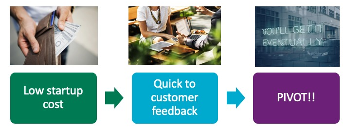
MVPs can allow someone with not a lot of startup cash to change the business rapidly (or pivot) when customer feedback finds they were on the wrong idea, the idea is not feasible
What’s the limitation?

Burbn was a check in app inspired by drinking. It had too many features but users were mostly posting photos and then pivoted to Instagram! Focusing solely on photo sharing and the rest is history.
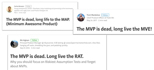
This highlights the trouble with MVPs. Most are just checking out if a market is viable first so aren’t exactly usable as products. There’s also the trouble of pivoting/changing to see if the value proposition is viable and this takes time and energy. Plus, a lot are being built with ready made libraries of code because getting your own system set up takes a lot of money – hence the temptation to use bootstrap or Material Design from Google. This puts the responsibility of making the app accessible author dependent even if these libraries come with some accessibility in built (you still need to check). There’s a temptation to get rid of the MVP all together for its associated problems and who could be blamed? It can be a severely limiting concept.
For this article
- We will focus on an MVP that is actually going out to a target customer
- Is the starting point that will be built on
- It’s not a Facebook page collecting likes for a startup that might deliver self portrait taro lattes to your cat(s)* (I expect a cut if you make this happen though!)
2. Why do accessibility in MVPs?
My classic situation
- A researcher has made a fantastic discovery about 5 years ago
- This technology is attracting interest in developing markets
- They want to take it to market and have HUMANS use it
- There is an early adopter willing to pay money for it

The limitations of MVPs for accessibility
- Being lean doesn’t encourage catering to users that have not been assumed to be the “default”
- Meeting accessibility standards is often seen as extra time in development
- Extra time = extra money = extra investment in making tech accessible that may be dumped when the business needs to pivot.
Don’t plan for exclusion, don’t leave it to the last minute
What should happen in a lot of research and development is that we should plan for what our users need and not leave it until testing. This is planning to fail! What we miss out on here is that there is actually A LOT of difference in the “normal” population. 14.1% of Australians of working age identify as having a disability – 2.2 million people – that’s a lot of people and potential customers being excluded from products if we don’t plan for some kind of accessibility. Most people I’ve encountered in user testing, however, do not consider themselves as disabled although they do have accessibility needs (e.g. bigger text, different screen colours). Also, not many are particularly candid with this information at first and I had several conversations with a client representative until they revealed they had a reasonably rare condition and the lean way I had design the interface meant I had excluded them. That’s right, they were the representative of our main client – a very stupid mistake to make.
If your MVP does not include accessibility…
- You’re missing out on a huge customer segment
- Your product may be unsuitable for valuable corporate/government clients
- Waiting until the testing phase of the project to see if it is usable or satisfies accessibility requirements can waste a lot of time and money for things that should have been done much earlier
3. How do we do accessibility for MVPs?
In short:
- With difficulty, that is ultimately worth it
- Ideally it is “baked in” (considered from the very beginning)
- There will probably not be a lot of money for calling in an accessibility consultant
- You will probably have to use some version of WCAG 2.0+ and situational awareness
- Most likely your team will then have to wrestle with whichever tech stack they chose from the outset when the product was a mere experiment (retrofitting!)
What is WCAG?

It is the governing standard for accessibility compliance accepted by most government agencies. But remember – since a Minimal Viable Product is minimal the majority of the guidelines won’t apply! It is full of things one should be doing anyway, such as making links clear and providing good alt text to an image where appropriate. I am of the firm belief that accessibility guidelines can only make your project better and there are a myriad of resources out there to help you understand them. Also getting to the ‘A’ level of accessibility will make your product better than the majority of products out there that don’t consider accessibility at all.
Benefits of WCAG

WCAG can give you a clear idea of what accessibility issues to tackle. It doesn’t cover every accessibility issue, and you will have to have open dialogues with your customers and listen to their needs, but it is definitely a start.
WCAG can also be :
- Time tracked and commented on in JIRA or other project management software
- Gives clear tasks for teams to get started on
- Gives the business clear goals to get to a minimum standard
Sometime the WCAG guidelines will make serious demands of the business and can feel like a lot of work in the beginning. However, once you’ve done one accessibility audit, it will be easier the second time around. It also will benefit users that you didn’t anticipate – and more information about the “solve for many” ideology of situational awareness can be found in Microsoft’s Inclusive Design Kit. These issues might not be on your radar now, but they could be on your next client’s radar already.
Consider This Scenario
- You’re making a pilot of a new delivery service for specialist materials
- The previous developer has used a variant of the Material library
- There will be government clients using this so accessibility will have to be considered
- There is also a limited budget (surprise!)
You find that they need
- A shopping cart
- An organised catalog
- A way to get complex receipts
- Search and filter many specialised products with no pictures
This can translate to…
- For the cart: Keyboard accessible, Contrast issues with buttons, tab order
- For the catalog: Tab order, Contrast issues, multiple ways of navigation
- For the receipts: Form elements and fields, Error prevention, link labels, validation errors
- For the search: Form elements and fields, link labels
This means we must make a plan to put these into our MVP
- Make a plan (what aspects of the WCAG can you realistically cover
- What is going to change in development
- How much time can realistically go into covering accessibility issues
- How many sprints will this take
- Most importantly: who is responsible for what?
Easy Wins vs. Not Easy
There are simple things you can do to make the accessibility better. These include link underlines, site maps, alt text of branding, and contrast correction.
Others are more complications such as custom ARIA, search with error handling, long desc of graphs, dealing with random animations of the Material Design library on keyboard input.
Know what you can handle and where there are simple ways to achieve similar things.
A Checklist for getting Accessibility for MVPs right
- Check for new content every sprint e.g. new videos – do they have captioning? new images – do they have appropriate alt text?
- That clients involve know why cosmetic changes are happening – these can irritate customers that are used to the app, clearly communicate that you’re trying to be more accessible.
- Have a timeline of changes and generally leave the most emotionally charged changes to last (e.g. branding colours). The lowest emotional charge one are generally things like underline links but changes to navigation or ways of doing things are a medium emotional charge. Do the easiest first.
- Allow adequate time for feedback and testing – once people know you’re serious about accessibility they might start communicating their needs better. This is positive, embrace it! But use the automated checkers out there (e.g. WAVE or Axe) to see if you’re reaching your goals. I once had a client who communicated that the bright colours of an interface were very distressing to them after several rounds of feedback. Keep listening!
- Choose the easier ways of doing things – you don’t necessarily need a hamburger menu for an MVP and I’ve found several implementations that play havoc with screen readers. Keep it simple, this is an MVP!
4. Accept that it can’t be perfect and there are new challenges
There are still no real solutions for making charts and maps accessible and that is the challenge we face. We can embrace it with open arms and do things in more accessible ways though and that is work worth doing. However – clients love getting this stuff fixed, you will be their new favourite. They will come back for more customised features if you’re willing to try harder to include more people and stop designing for the “default”. Just work an accessibility consultant into the beta budget!
Thank you A11y Camp 2018 for accepting this talk
Intopia run a highly excellent conference called A11y camp where this content was first delivered. Thank you for the opportunity!
